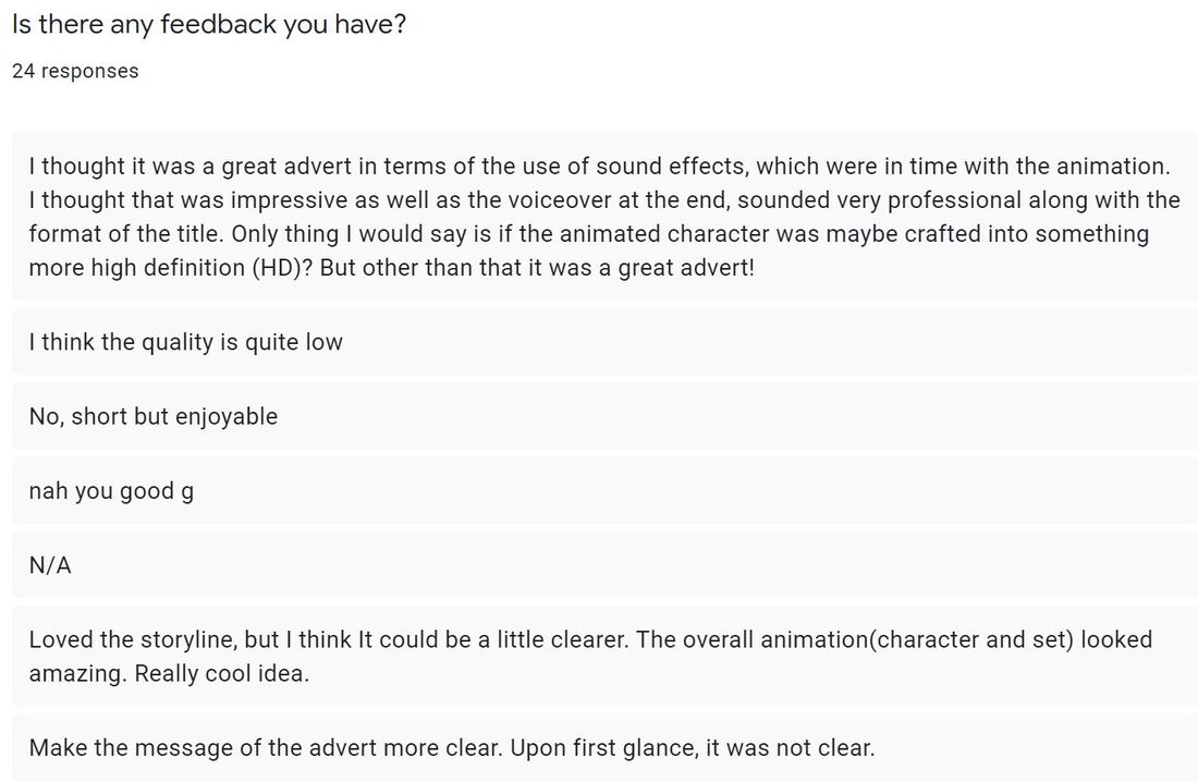
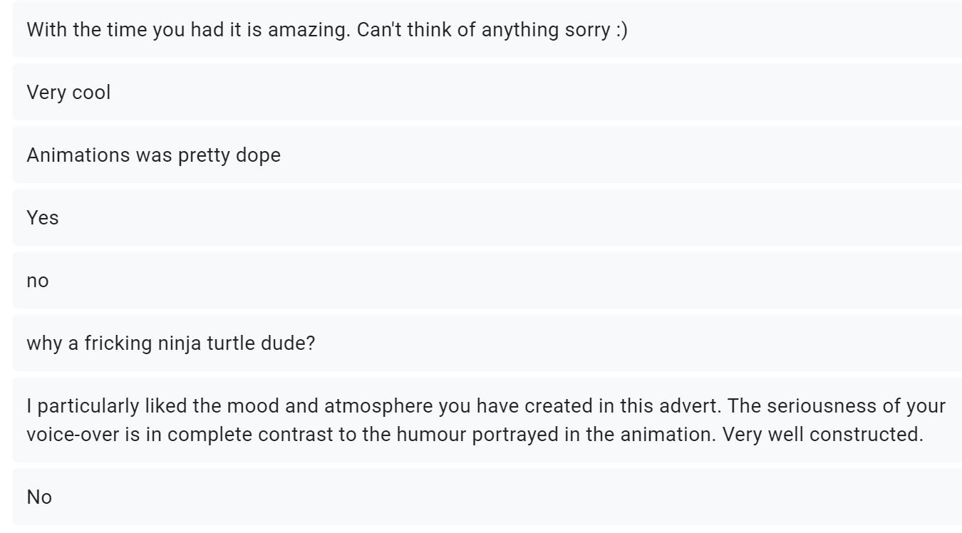
Audience Feedback

This starting question is a basic question ask everytime I do a project. A very simple yes or no to determine whether or not I created a successful project. Yes, I may have good feedback due to the audience being my friends and family but I ask for honest criticism and feedback. So far none of my projects have not been enjoyable for the audience, but it is always worth including to see if I am on the right track.

I felt like this question came out this way due to the type of course I am on, I felt the only reason it would not fit a typical advert style is due to it being a short 3D animation rather than a well rounded live action short film. This question is to fully determine my creative vision and to see if I can follow a brief.

This question is completely open to the audience interpretation as to if they understood the story. I felt that the story behind the advert was simple and easy to follow with the fun juxtaposition of the slogan to the visual story telling. The story was of a character who found it difficult to use the vending machine, where the slogan is "vending made easy".

Another question I include in all my feedback forms is the favourite features question. I like yo understand the best elements of each of my pieces and this time the set and texturing came out on top. This is good because I can see what needs more work and what was great. In this project my focus was the set and cinematics and this was the highest voted point. All other elements were fairly equal so it shows it was a well rounded project!

This was just a random question as I wanted to see the thoughts of the audience in 1 word. This was good because it gave me an idea of audience emotions. All in all the feedback was great and the project seemed to be fun, entertaining, imaginative and overall just an enjoyable project in general.
Final Evaluation 1500 words |
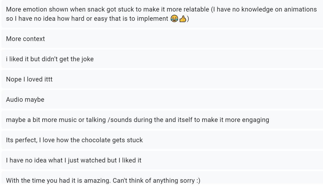
Again a question I always include is the feedback element. This time round the feedback was very positive. There was very little constructive feedback! It was mostly people loving it and giving minor feedback like story clarity and sound effects, that is it really! All in all I felt all the feedback was helpful and shows everyone enjoyed my project, for some I need to make the message of my pieces clear.
|
This project was a pleasure to work on from the start, up until the finish and I think came out very well. I felt this project allowed me to demonstrate my abilities to a high standard, whilst allowing me to express my artistic visions creatively. The project allowed me to develop those skills already learnt to a higher standard and then integrate these skills in my new and future projects. Throughout the project I had unfortunately faced a number of technical issues over the course of the project, the main being that I did not have access to my PC. At the end of the last project my PC broke and was not returned to during the creation of this one and is annoyingly still not with me now. This meant I had to work on the only other device available- my Windows Surface Pro. This device is in no way meant to handle the processing power that Maya needs to run, there is one USB port and the mouse does not have a middle scroll wheel,meaning I could not navigate my programmes fully. This therefore caused the rendering of each scene to take much longer than it would have originally done on my PC. Due to the Surface Pro not being created to handle Maya it crashed a lot and ended up corrupting my project completely, this then prohibited me from completing the project to my full potential and did not allow me to meet all the storyboard points I had created. Having said this I am in the extremely fortunate position of being able to create any sort of 3D work and have anything to show at all. My peers have struggled with tech and have been forced to draw or stop motion animate their projects, lowering the work quality they usually work at. This obviously can be damaging as we are on a 3D course so in this respect I realise how lucky I am and I am very thankful for the work I have been able to produce, despite the technical issues I did face. I really do love my final advert.
I started the project where I would start any project, with storyboarding. From a very early stage in the development process, I knew what I wanted my final ad to look like. After confirming my storyboard I began working on my set in Maya. I began with the Vending Machine itself and after moved onto the set as a whole. Based on a French service station I stopped during my ski trip in 2019, the set is simple, yet I feel very effective and aesthetically pleasing. It does the job and builds a realistic, creative environment that allows me to accurately tell a story. After the modelling I started with initial texturing and after it was put in place I started playing around with lighting. Whilst doing so, I realised I could make the quality of the project soar. Before this project I was not overly sure how Arnold lighting worked in Maya and how to use it realistically. Throughout this project however, I managed to get a grip on it, changing the colours and the strength of each light as I went. I also learnt how to make objects and surfaces glow or emit light. This light emission technique was then used inside the machine itself and I feel it brings life to an otherwise quite flat object. The light coming from inside the vending machine gives life to the machine itself and the objects inside. It illuminates our character and the objects chosen whilst also drawing the audience focus into the colourful machine itself. The vending machine is full of fun Easter Eggs and nods to my past productions (check the crisp packets) and multiple Pixar references such as the Buy N Large company logo from Walle. This inspired my own brand, Notrevihc's. The main feature of the machine is that branding. Notrevihc’s is a brand I have set up inside my production universe and is much like Buy N Large, which is a corporation in the Pixar universe. Notrevihc’s has previously appeared as the company who built Clank and Noland in my last project and is quite a personal Easter Egg to myself. Notrevihc is my Grandfather's surname backwards. Robin John Chiverton was an artist, my grandfather and art inspiration. Since he passed he has been the inspiration for a few of my ideas both past and future and I cannot wait to dive into this new brand across my career. Notrevihc also has a much deeper explanation. My Grandfather grew up on the Isle of Wight, and a few years ago I learnt that my ancestors were not as boring as I thought. They were in fact a group of Isle of Wight smugglers and were known as Notrevihc. Not much can be found on the group but it is a fun reference to my life and family that, unless you know me personally, the audience would not know. Keep your eye out for more in future projects!
In terms of the character, the Teenage Mutant Ninja Turtle was an impulsive choice I made when browsing free 3D characters. In the end I actually felt the choice was right and that the character correctly reflects the mood of the piece quite well. The orange turtle, known as Mikey or Michelangelo, is the funny, witty and charming turtle in the group and I think reflects the fun, entertaining aspect to my advert. He also fits well as I think it would be something he would do/something that we as an audience would see him do in the shows. I would have preferred to work a lot more with the character, animate more smoothly and add more scenes, but again as explained my project gave up on me… The rig is great as it was a free one and saved me a heap of stress and time, although was quite confusing to navigate and was, at times annoyingly rigged in terms of control ease. During animation, Maya started glitching so I thankfully rendered out the fall of the crisps and after it finished the file corrupted. I would have wanted to render out a walking scene both to and from the machine, with cinematics of possible puddles and rain. I would have also loved to make the head thump scene more fluid and realistic. This would include animating extra body parts like the head, bandana and hips to give a better and more realistic anatomical reaction.
Responding to feedback
I felt like the feedback I received was very helpful. There were no negative comments and was all mostly constructive criticism. Everyone seemed to enjoy my advert, although some did not quite understand the story. In my opinion I thought the overall story was quite clear but if you ask for the audiences opinions, you have to listen. Next time round I will ensure the message is clear to all. The message/story of the project is meant to be ironic. The story follows a character coming to buy something from a vending machine, and in doing so their choice gets snagged half way down the machine. At the end of the piece the logo and slogan is revealed. “Notrevihc’s, vending made easy!” This is meant to be ironic and is what is known as a juxtaposition, meaning a direct opposite or contrast in themes. The events of the story (a hard, frustrating experience with Notrevihc machines) directly opposes the morals and slogan of the company (vending made easy).
This project, in my eyes, was a chance to allow me to show off my modelling and set design skills. I asked the audience what their favourite features of my advert was. My hope was that the set would have the largest amount of votes for the top feature of my project. To my satisfaction the set came out on top with 33.3% of the votes. All other categories followed very evenly with 20.8% going to music and voice overs, 16.7% going to the story and animation and finally 12.5% going to the character. I always thought from the start the animation and character would come out on bottom. The character may have seemed random to some audience members but I thought about it and the explanation I gave above shows how I confirmed my choice. The animation in features usually gets overlooked by those who do not fully appreciate or know about the industry so I expected a lower vote with this in account. Overall the feedback was helpful for that short amount that was given. The key thing I did take away was to ensure clarity to all audience members and to have a solid score or soundtrack.
All in all I felt my project went really well. As well as it could have done at least. I definitely learnt lessons throughout this project's production process, such as remembering to back up and save an extra copy of my work- especially at each key point in the project! I think next time I may do each shot on seperate projects to ensure I do not fill my scene with so much coding. Doing this will therefore allow myself not to overwhelm the computer or device I am working on. The project as a whole taught me a lot in terms of my modelling and allowed me to learn skills I think will make my future work quality excel. I feel that in the future I can continue to develop the texturing of objects to make them even more realistic. The reflective aspects, as mentioned work well to build realism but if my project did not corrupt I would definitely toned the reflectivity of the drinking fountains down. I also would have added roughness to the given textures like the wall. I would also have moved the lighting of the snack choice scene to match that of the scene where the crisp packet gets stuck. This was an error/ inconsistency I found during my post production, it is not a major error but is noticeable to myself. In conclusion I know what needs to be improved upon but all together the project was a pleasure to work on and I thoroughly enjoyed creating an advertisement. With the time and resources I had, I felt I produced a high quality piece of work to add to my ever growing showreel and I am grateful I managed to get any sort of 3D project created in these unprecedented times.
